Inspire By Color
Wait...what?! I’m almost afraid to admit it has been nearly 20 years since I started creating custom, high-end finishes for the residential market in our area.
Color selection is integral to my work – and your home – so let me share some advice on the topic.
The biggest challenge when selecting color for your home is that the possibilities are virtually endless. This can be great, and also overwhelming. Let’s face it, inspiration is everywhere: You have Pinterest, Houzz, that design-savvy best friend and a bottle of Prosecco. What could go wrong? Ha-ha!
But when it comes to creating a cohesive color palette for your home, you'll want to curb the excitement and pare your palette down to about three main colors. Most likely these three colors will be represented as wall color, trim color and accent color. These chosen three selections should be pulled from your least flexible design element in the space. For kitchens and baths, your anchor colors are usually found in the countertops and floor tile. Living and dining room palettes are often informed by fireplace surrounds, ceiling beams or your favorite fabric selections.
Create Room-to-Room Continuity: Once you have chosen your three anchor colors in the most important room of your home, usually kitchen, you'll want to honee in on the tonal quality that will build continuity from room to room throughout your home. This doesn’t mean every room has to be the same. Color continuity throughout the home is achieved by understanding the purpose of value, shade and tone. Meet your new best friend, the fan deck. Most paint suppliers offer this compressed format for color selection. The fan deck is perfectly formatted to find the best color because values, shades and tones are easily discernible when the deck is fanned out to display all the colors together in one square foot. Remember going into the big box store and staring at that huge wall of color chips? Never. Again! From the May/June issue of Mod Society Mag
Photos by Aura Marzouk Photography for Mod Society Magazine
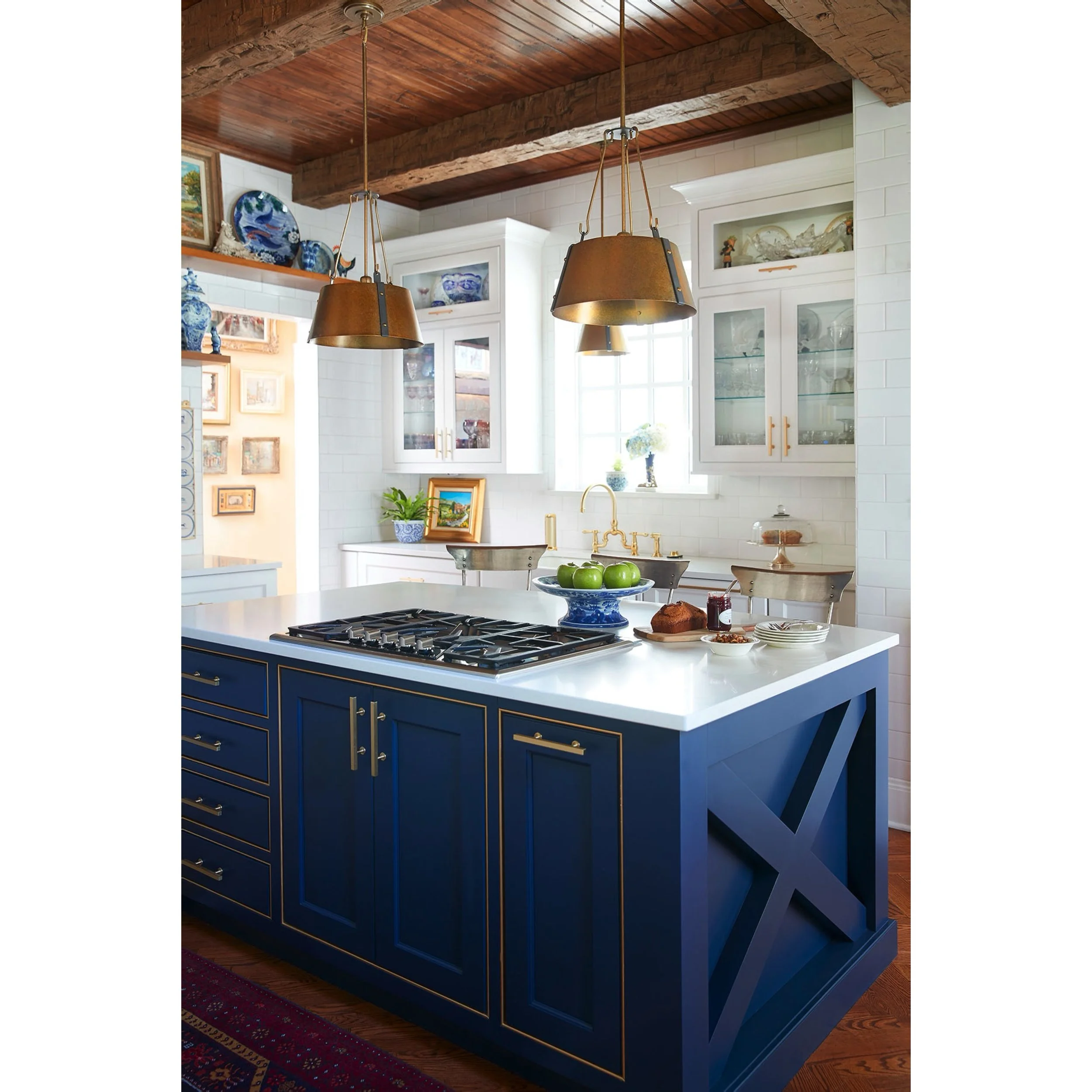
Navy blue vent hood and cooktop cabinets accent the neutral white kitchen
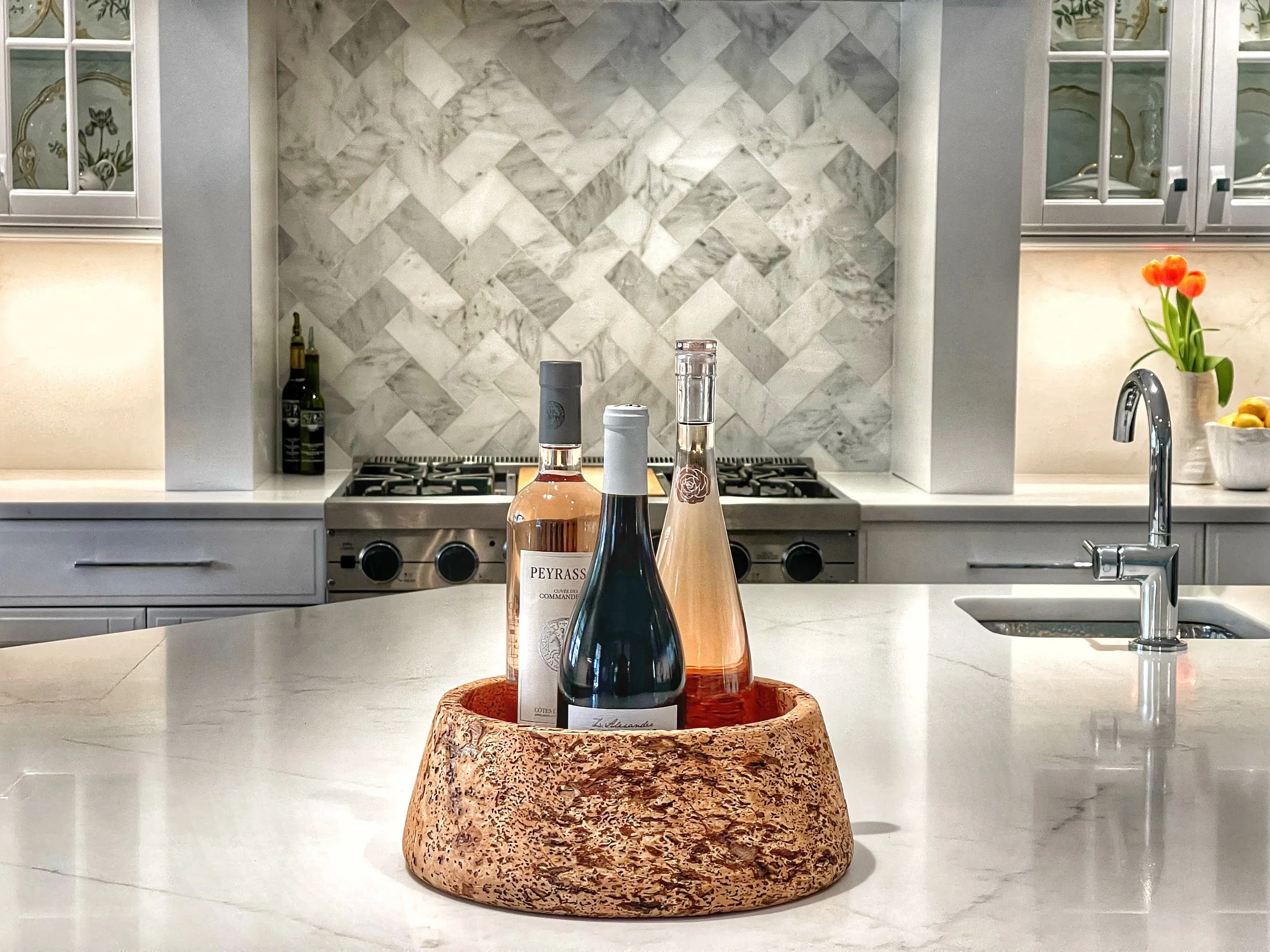
This beautiful Summerfield NC Kitchen pictured above was designed by Maria Adams Designs. Maria’s backsplash tile selection was clearly her anchor for the color palette. We worked together on selecting a cabinet finish that would bridge the traditional cabinet architecture with an updated style. The cabinet doors had heavy mouldings so we chose to add a soft greige accent glaze to the profiles. This made the finish design look more intentional while picking up the gray tones of tile and countertop veining.
Neutral white cabinets with a greige accent glaze, inspired by the backsplash tile and countertop.
Carpentry modifications included a new waste /recycling cabinet, vent hood and crown moulding with an added riser board to give the upper cabinets more height. New, polished nickel knobs, pulls and fixtures added a remarkably crisp and clean look. New soft-close hinges and drawer slides were added to make this kitchen feel as new as it looks.
BEFORE & AFTER: Please enjoy the following before/after images. We are so grateful to have been included in this remarkable kitchen transformation by Maria Adams Designs
Thank you so much for taking the time to follow along and I hope you are inspired by what you’ve seen here!
-Nathan


